Energy Demand Forecasting for US Households - Timeseries Forecasting Using Deep Learning

Table of Contents
Introduction
Energy consumption forecasting for buildings has immense value in energy efficiency and sustainability research. Accurate energy forecasting models have numerous implications in planning and energy optimization of buildings and campuses. Good forecasts can help to implement energy-saving policies and optimize operations of various energy-based systems. The results from these energy forecasting models provide us with a baseline to prevent wasteful energy consumption. This article summarizes the experimentation and shares the results of the energy demand forecasting for a building.
Objective
The Objective of the project is to implement time series forecasting models to forecast energy consumption for a building. This is carried out using various features in the dataset such as historical energy consumption (2014–2016), temperature readings at nearby buildings, holidays, and other synthetic features. Our aim is to build a model that will impact energy management systems for the better.
Exploratory Data Analysis (EDA)
Any machine learning model is only as good as the data on which the model was trained. It is vital to understand the data in terms of its distribution, correlation, and other parameters. In the following section, We shall explore each of the parameters used to understand the data.
(1) Time Series and Distribution Plot
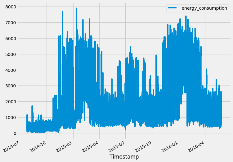
Firstly, to get an overview of the given data, we plotted the time-series plot with energy consumption along the y-axis and timestamp along the x-axis. The graph looks periodic at first-sight (further elaboration in later sections).
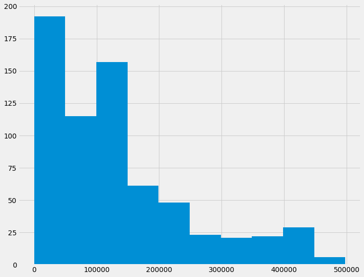
Next, we plot the distribution graph of energy consumption and it is evident that the data is not normally distributed. It is important to note that making the input data normally distributed helps the model learn much faster.
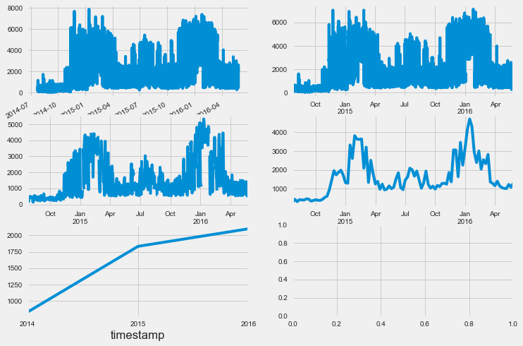
To extend the time-series visualization, We resampled the given data (originally sampled at an interval of 15 mins) at 1 Hour, 1 Day, 1 Month, and 1 Year. The first plot shows the original data (15 Mins) and the following plots show the resampled data at the respective intervals.
(2) Energy Consumption Plot On an Hourly Basis
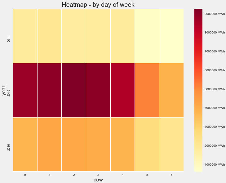
To study the distribution of energy consumption, we group the data on an hourly and daily basis. This grouped data were visualized using heat maps.
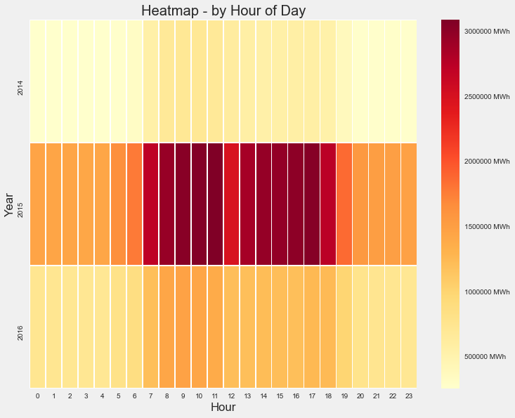
We can infer from the heatmap that energy consumption has relatively high values from 7 AM till 6 PM in the hourly plot. The same is true from Monday (dow=0) to Friday (dow=4) in the daily plot. So these are potential features that could be used as input to train our model.
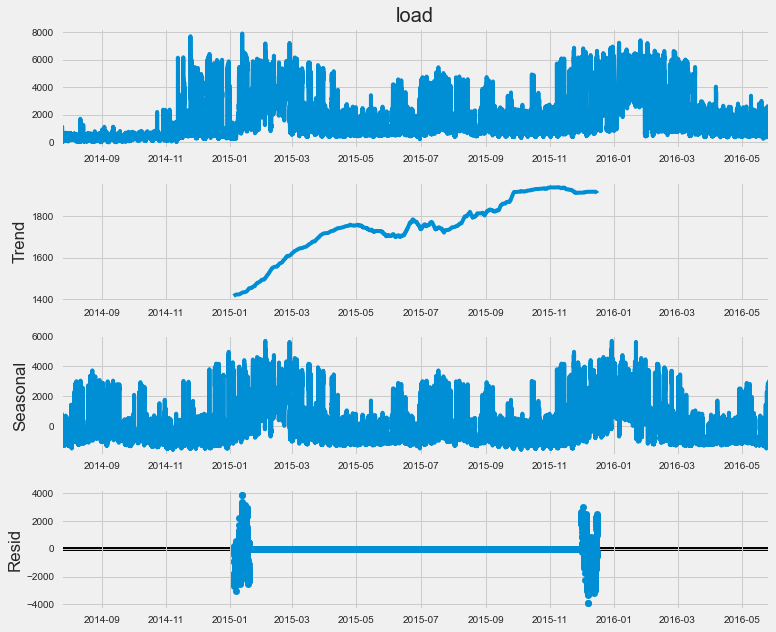
(3) Statistical Decomposition
For any given time-series data, we can decompose and express it as a sum or product of trend, seasonality, and noise/residuals. So to identify the trend and seasonality we used the statsmodel library to decompose the energy consumption data. The inference is as follows:
-
There is a clear Upward trend as time increases.
-
The time-series data is highly seasonal
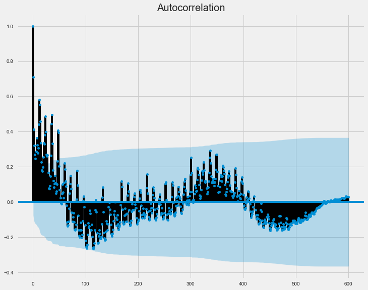
(4) Autocorrelation Plot
Auto-correlation gives us the correlation of the data with itself. In layman terms, if the current observation of the variable is correlated with the past observations, we could use the lagged data for forecasting the future.
We plotted the autocorrelation values for 600 lags. We observe that this plot has the shape of an exponentially decaying sine wave. The blue shaded region signifies the confidence interval of 5%. All the autocorrelation values which lie inside the blue region can be considered insignificant due to the distribution of the data.
We resampled the 15-Minute interval data into daily intervals and plotted the autocorrelation plot. The key observation from the plot is that the autocorrelation value peaks every 12-days and its importance reduces with the passage of time until the peaks lie inside the blue region.
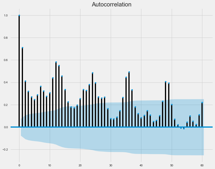
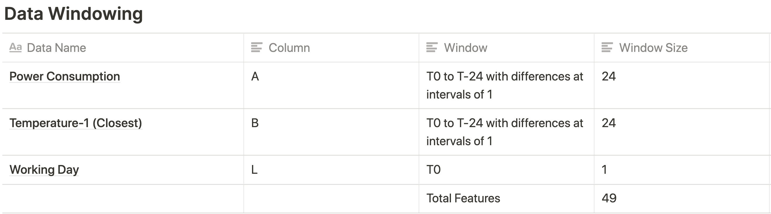
From the above observation, we conclude that a window size of 12 days can be used to select the most important features for our model.
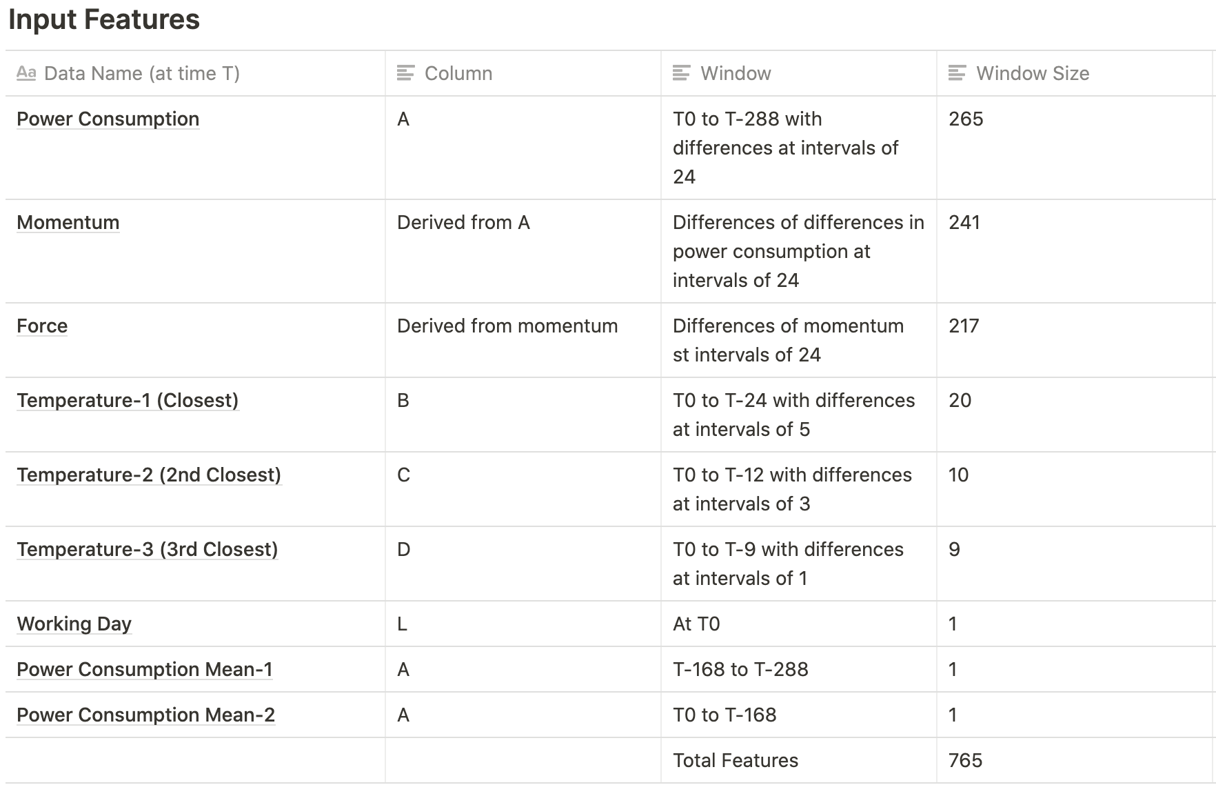
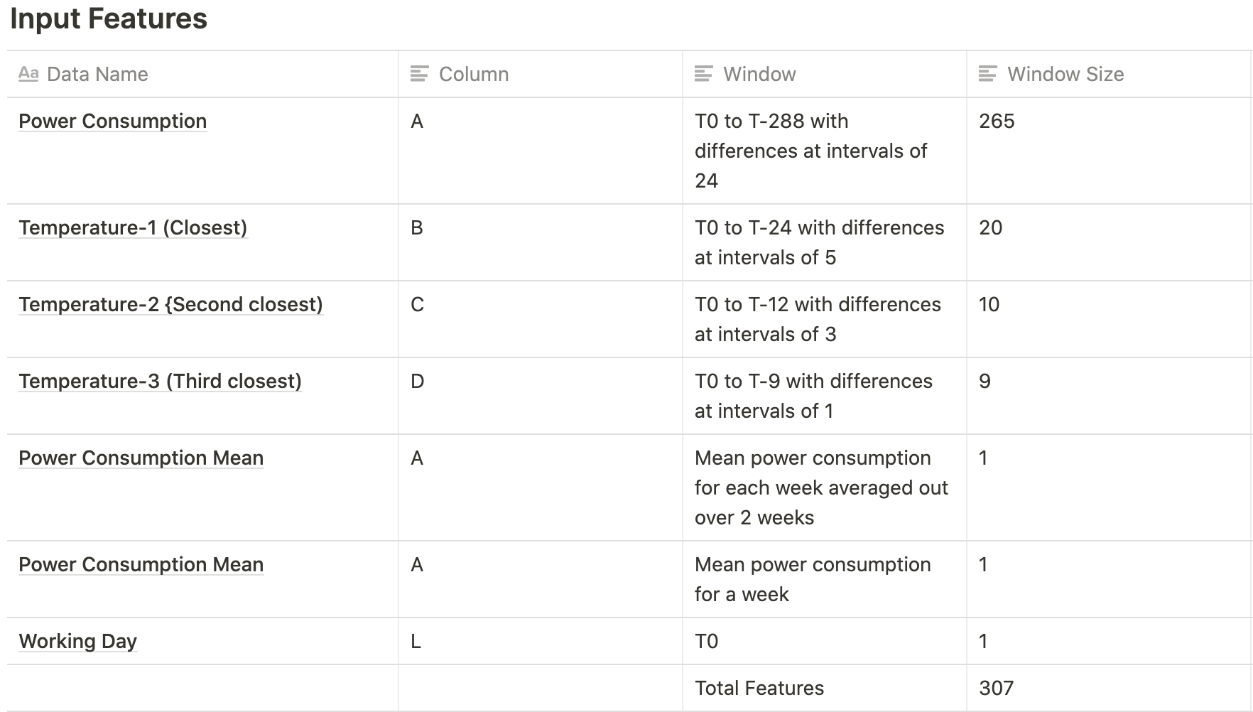
Feature Engineering
The Performance of a model greatly depends upon the quality of the input data on which it has been trained. We spent a large amount of time selecting the relevant features and synthesizing custom features. In this section, we will discuss the methods that we used in our pipeline.
(1) Log Normalization
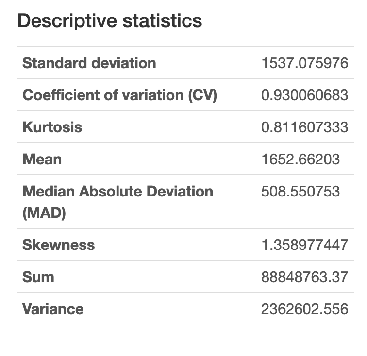
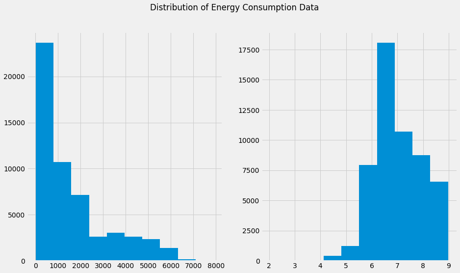
To follow up on the distribution of the energy consumption data from the EDA, we clearly observe that the data has a high positive skewness (1.358) which is not ideal while training a model.
To combat the problems caused by the skewness of the data, we apply logarithmic normalization. This reduces the skewness of the data. This can be observed from the below distributions.
(2) Adding Temporal Components
From the heatmaps in the EDA, we infer that features such as day of the week and hour of the day could be important to forecast energy consumption. We achieved this by splitting the DateTime component into its constituents such as day of the week, day of the year, week of the year, day of the month. We also added a categorical variable to represent holidays.
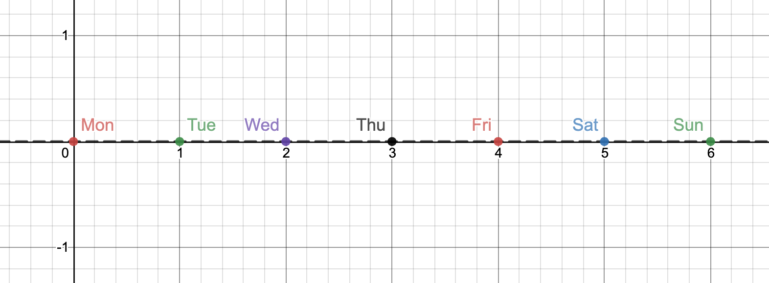
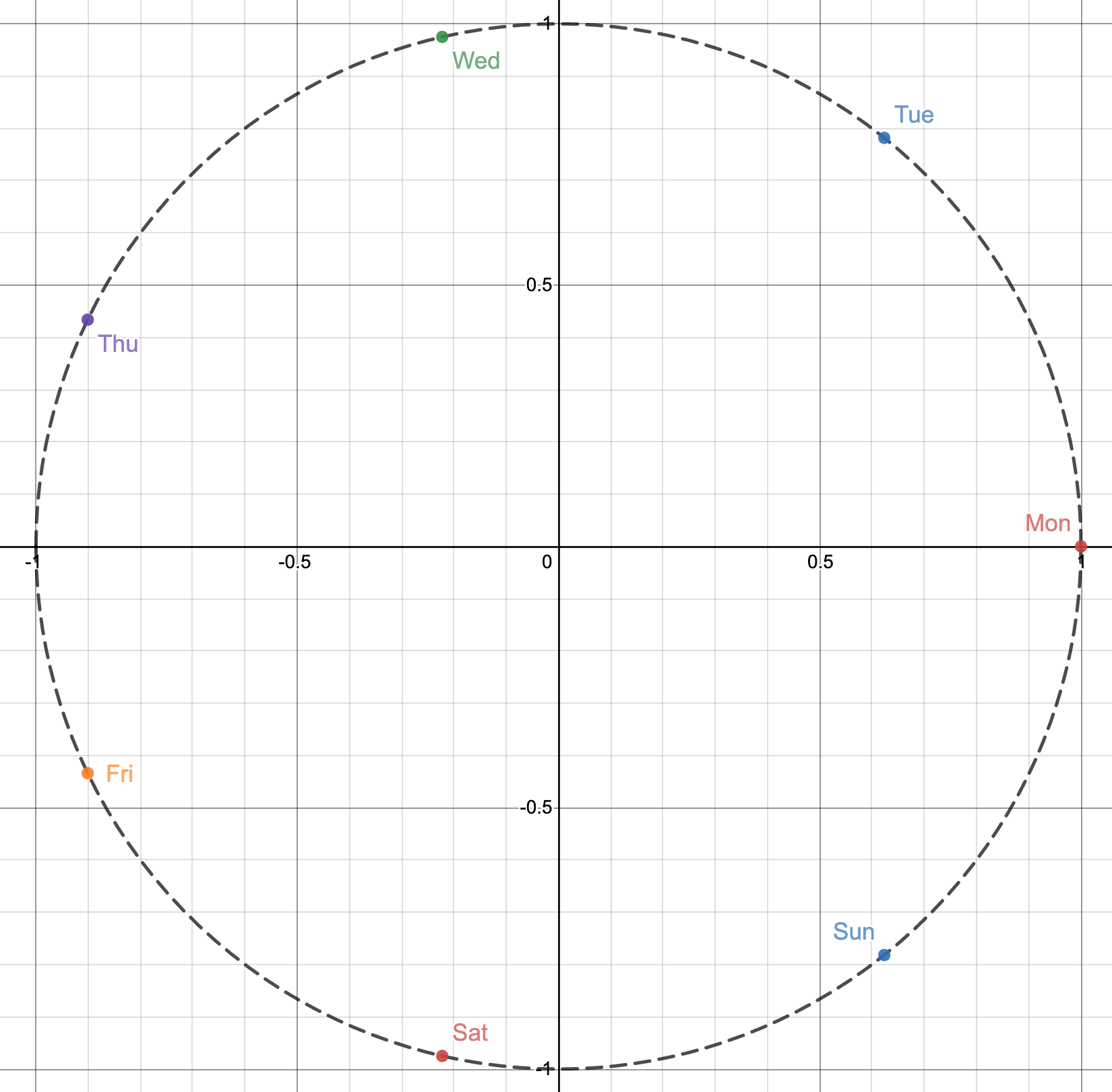
(3) Adding Cyclic Nature to Temporal Components
Let’s consider, our original day of the week variable(numerical) in which ‘0’ corresponds to Monday, ‘1’ to Tuesday, and so on. In this system, Sunday will be represented by numerical value ‘6’. The fact that ‘0’ follows ‘6’ is not immediately evident to the model. This representation could be learned with enough data. We decided to speed up this process by providing the temporal data in a cyclic format. To make the temporal data cyclic we apply sine and cosine functions to these time components.
(4) Data Normalization
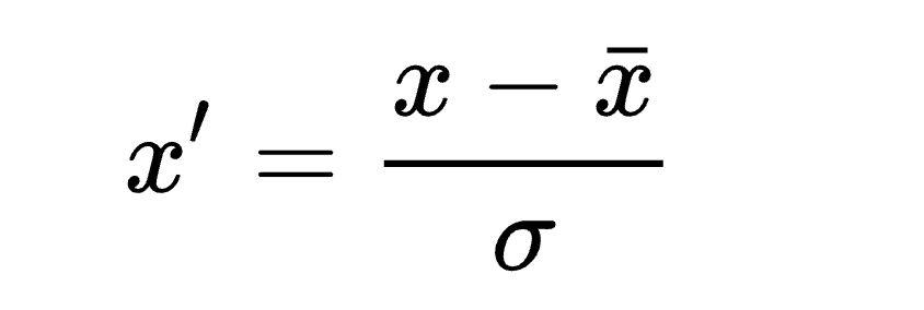
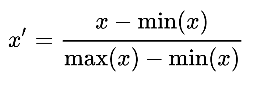
We performed z-normalization to all three temperature data and Min-Max normalization to the energy consumption data. Normalization helps to scale the inputs so that gradients are smaller and learning is faster.
Persistence and Experimentation
(1) Persistence
After fixing any data leaks through interpolation, resampling our data using 1-hour intervals, and performing some normalization we re-uploaded our new CSV file onto autocaffe.
We found the persistence value to be 0.0082089. With this, we had the target for our experimentation set and we began work on our naive model.
(2) Naive Approach
Our goal with the naive approach was to beat persistence with a bare-bones model. We also used an extremely reduced set of features to better gauge our starting point and allow for better and easier experimentation.
model
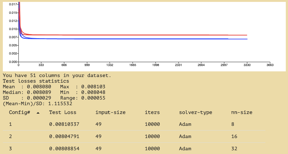
For the actual model, we had a pretty simple architecture with 4 layers with different neural network sizes (NN-Size) as follows,
-
NN-Size
-
NN-Size / 2
-
NN-Size / 4
-
Inner product
The NN Size itself was varied between 8, 16, and 32.
Output
Loss
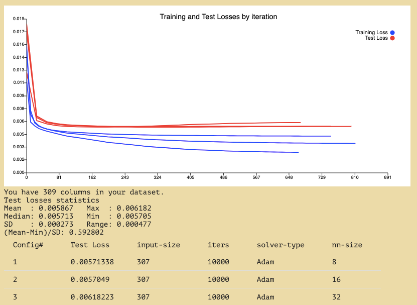
With our naive model, we were already able to beat the persistence RMSE loss with our best loss value of 0.008 for configs with NN-Size 16 and 32.
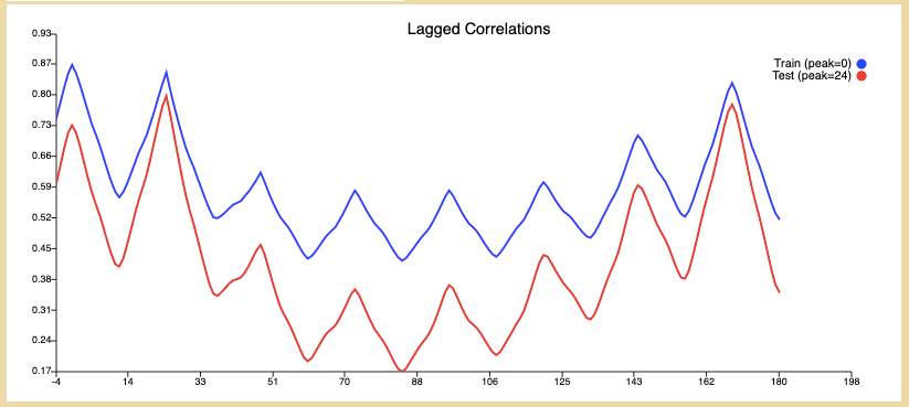
Lag
Apart from our loss another important benchmark for our model was to achieve a lag graph with a lag peak at time T+0.
The reason we have a lag peak at T+24 is because we are passing in the data at T+24 as a value during training as the value we want to be predicted, hence we get an exact prediction at that point. To find the actual lag of our predictions we must look at the second highest peak of our model.
In the case of this model, the lag seems to actually be at T+48, this is something we aimed to improve during our experimentation as well as reducing the loss. One of the ways in which we could reduce lag is by adding dropouts to our perception.
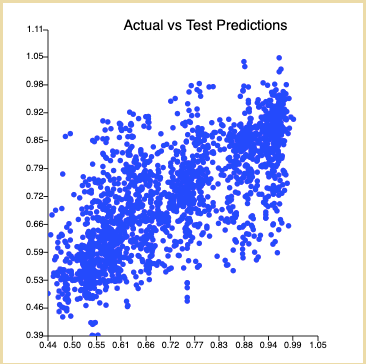
Actual vs Test Prediction
As expected with the naive approach of this model we got a very loose actual vs test prediction plot for this configuration.
(3) Experimentation
Experiment 1
In this experiment, we increased the number of features we used to see how the results would be affected. We also added one extra layer to our neural network structure.
Neural Net Configurations
The neural network was slightly updated since the last run with the addition of another layer with config NN-Size / 8.
Output
Loss
We can conclude from this loss graph that our model is clearly overfitting as a result of the great difference between the train and test losses. To combat this overfitting in our models moving forward we actively tried to include dropouts and regularisations.
Lag
From the graph below we can see that our second highest peak is at T+0 which is our desired goal, so in our further experimentation, we aim to modify the features and model to reduce loss but maintain the lag graph as is.
Actual vs Test Prediction
The actual vs test predictions graph is still very loose at this configuration.
Experiment 2
In this experiment, we tried decreasing the overfitting of the previous model by adding some regularization and dropouts. We also added momentum and force to the feature set.
Neural Net Configurations
The neural network configuration remains the same except for the addition of dropouts and regularisations.
Dropout probabilities = {{ 0.1, 0.15, 0.2 }}
Decay Rate = {{ 6.0E-4, 6.0E-5, 6.0E-6 }}
Output
Loss
We can see from the loss graph that the model is not overfitting anymore for many of the configs.
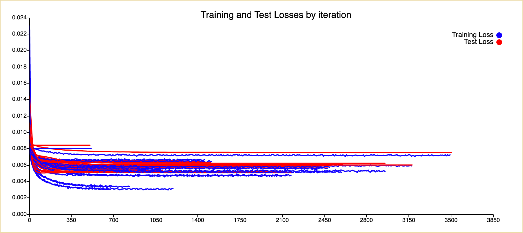
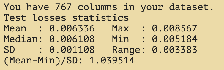
We got a minimum loss value of 0.005184 which beats persistence
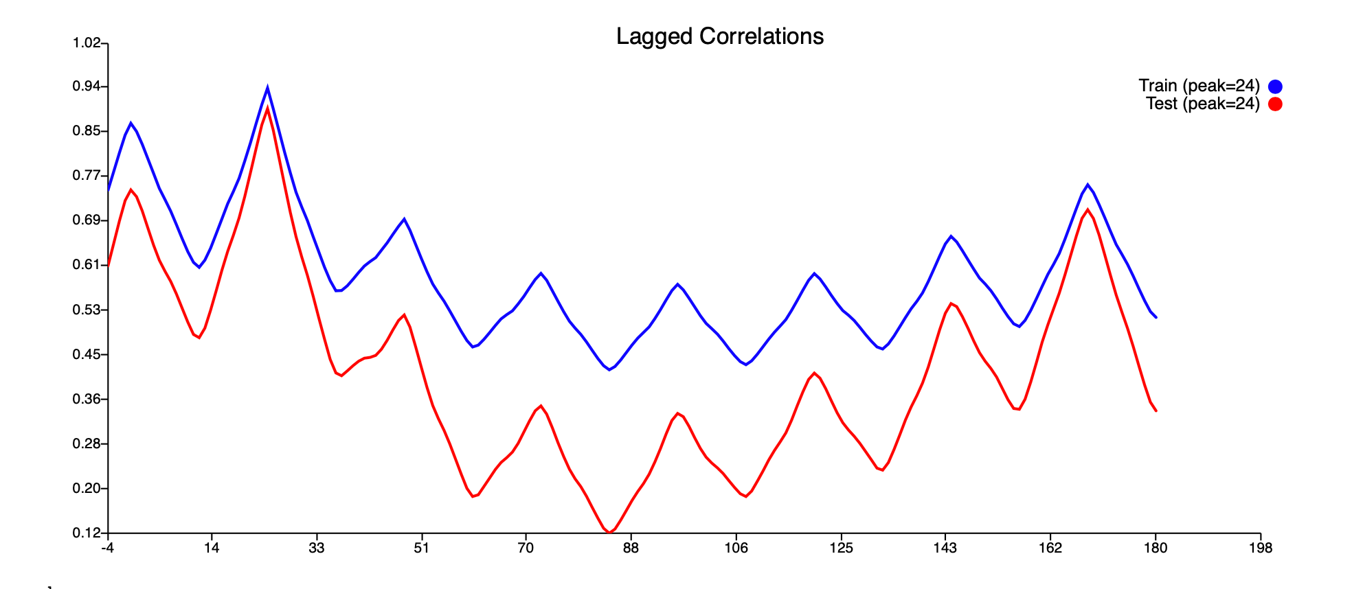
Lag
The second peak of the lag graph is at T0.
Experiment 3
Since the last experiment was successful in decreasing the overfitting, in this experiment, we tried using a big input size of raw features. We tried making our neural net big enough to handle the input size. This was done to try to decrease our loss by adding more features.
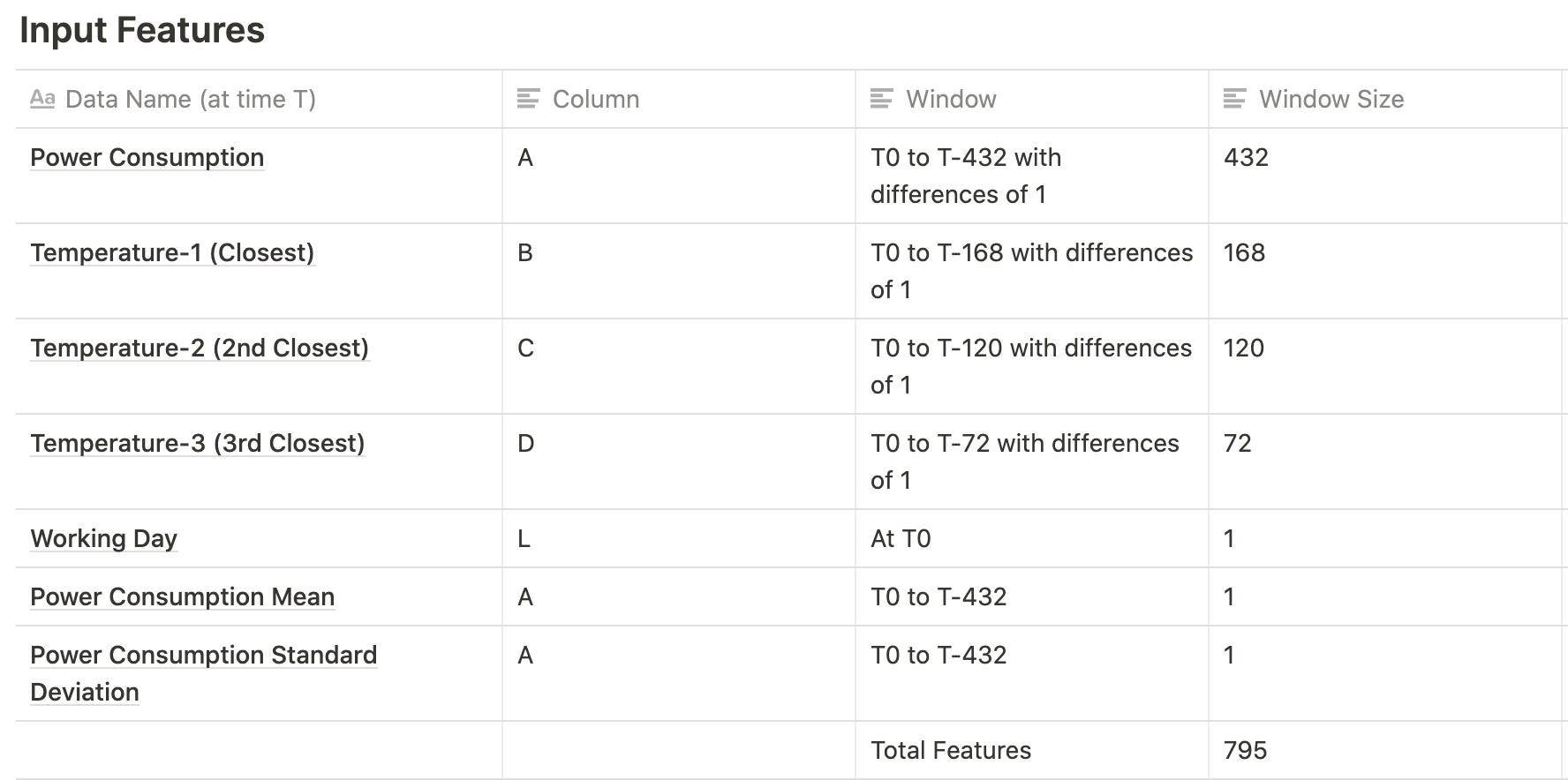
Neural Net Configurations
The neural network architecture remains the same. We add an NN-size of 64 in the configs for this experiment.
Output
Loss
There was a huge difference between our train and test loss. The configurations stopped early.
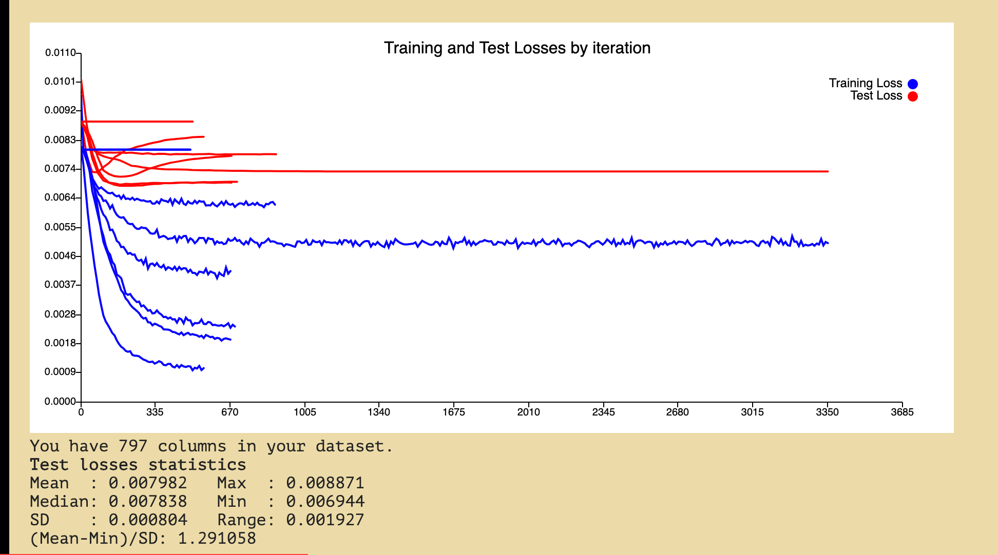
We stopped increasing the number of features and just played with our neural network configurations due to the disappointing results of this experiment.
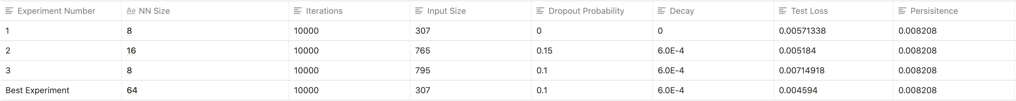
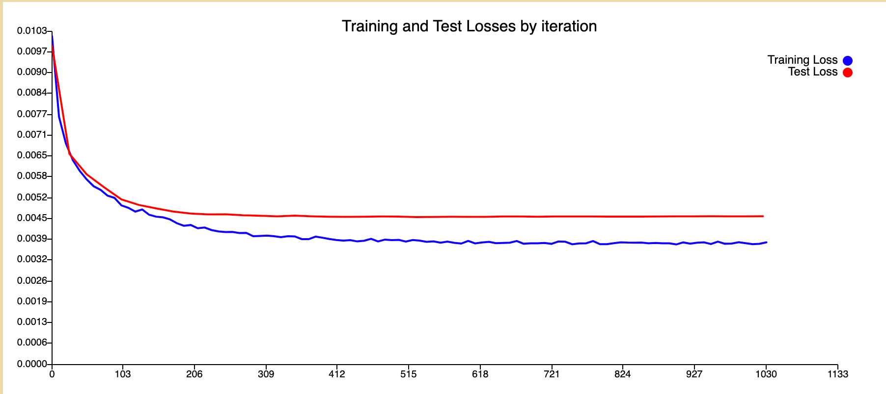
Results
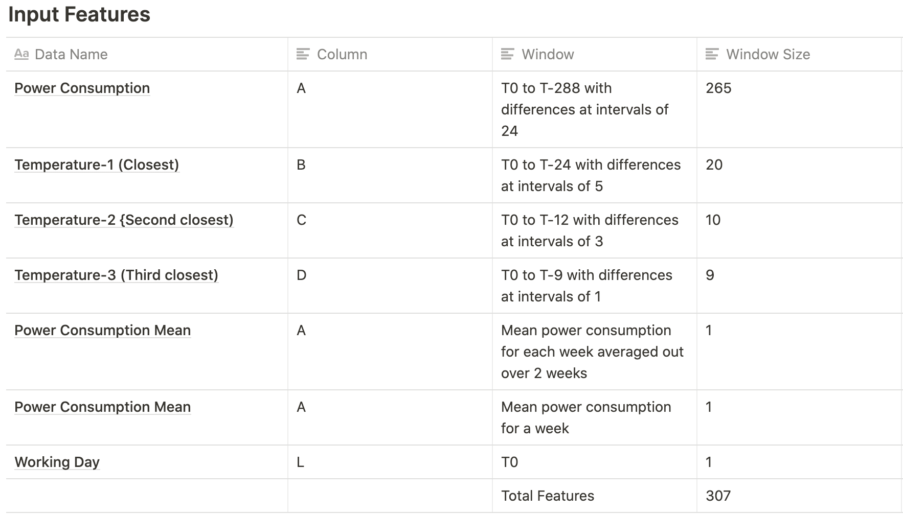
After multiple rounds of experimentation, we ended up with our optimal features and network.
Neural Network
The architecture is the same as Experiment 2 but with only one dropout probability value → 0.1, decay rate → 6.0E-4 and NN-size → 64 which we found to be optimal after our experimentation.
Results
Loss
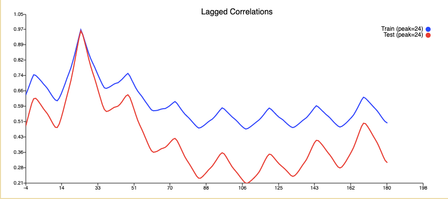
Our best performing configuration achieved a loss of 0.0045 which was consistent over a 10 repeat run with minimum variation.

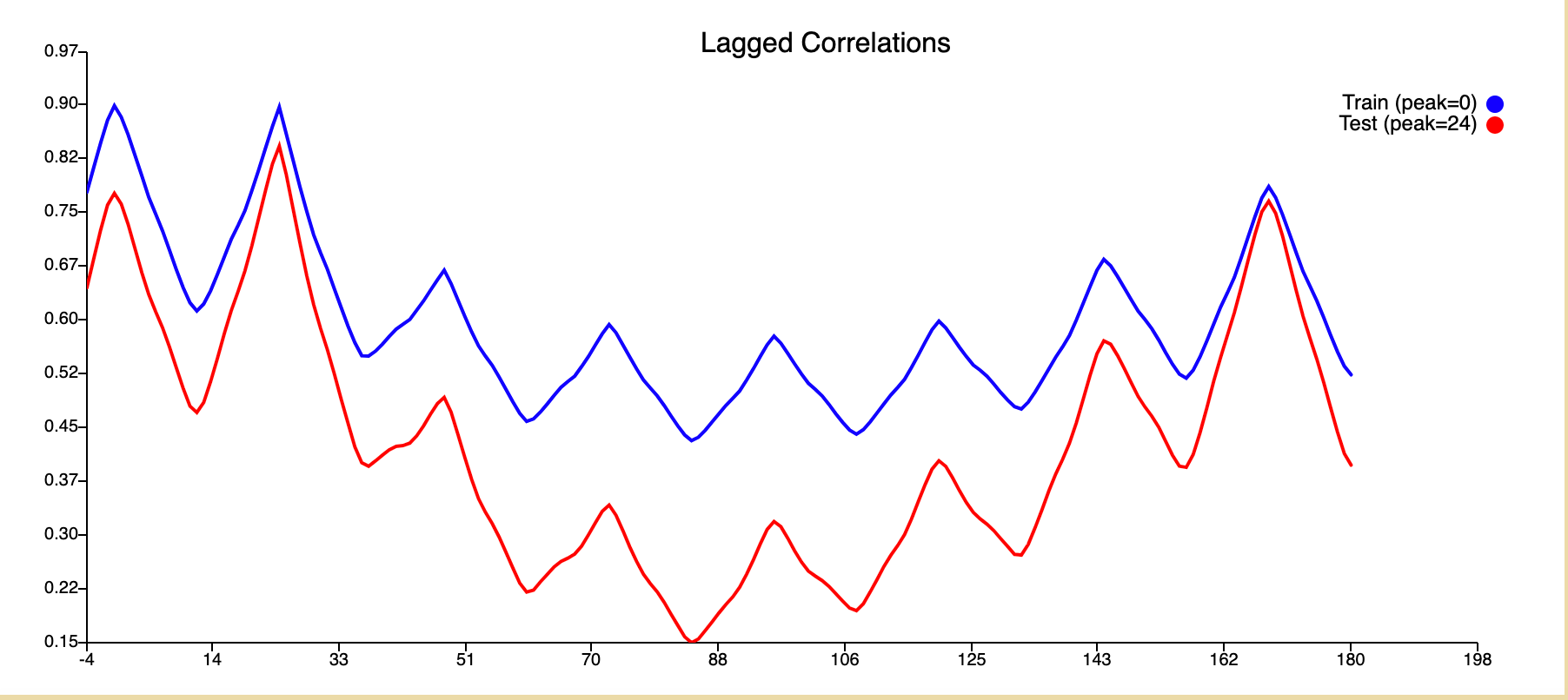
Lag
The lag graph maintains the second highest peak at T+0. From this, we can infer that our predictions have no lag.
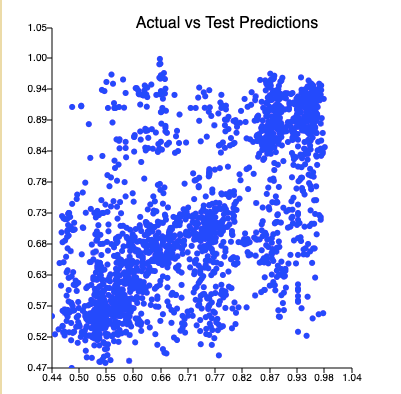
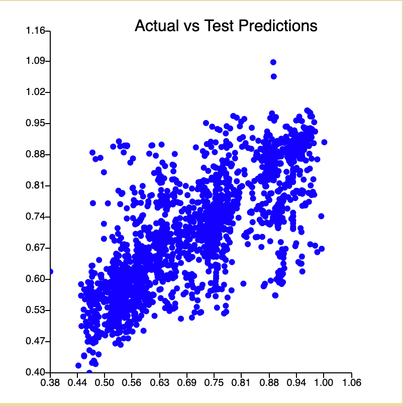
Actuals vs Test Predictions
The plot is definitely tighter than our naive model.
Potential Drawbacks & Further Improvements
Our current model does not have any cell state to memorize or forget values based on importance when forecasting the energy consumption data.
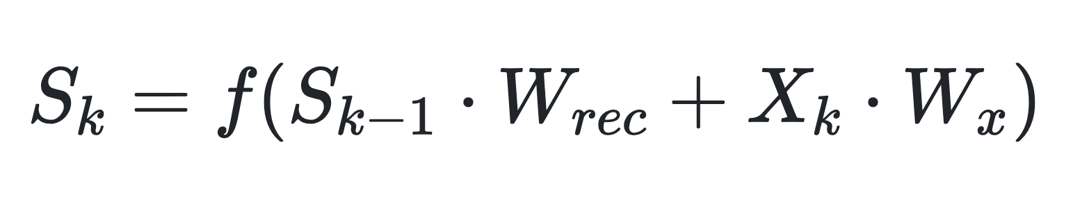
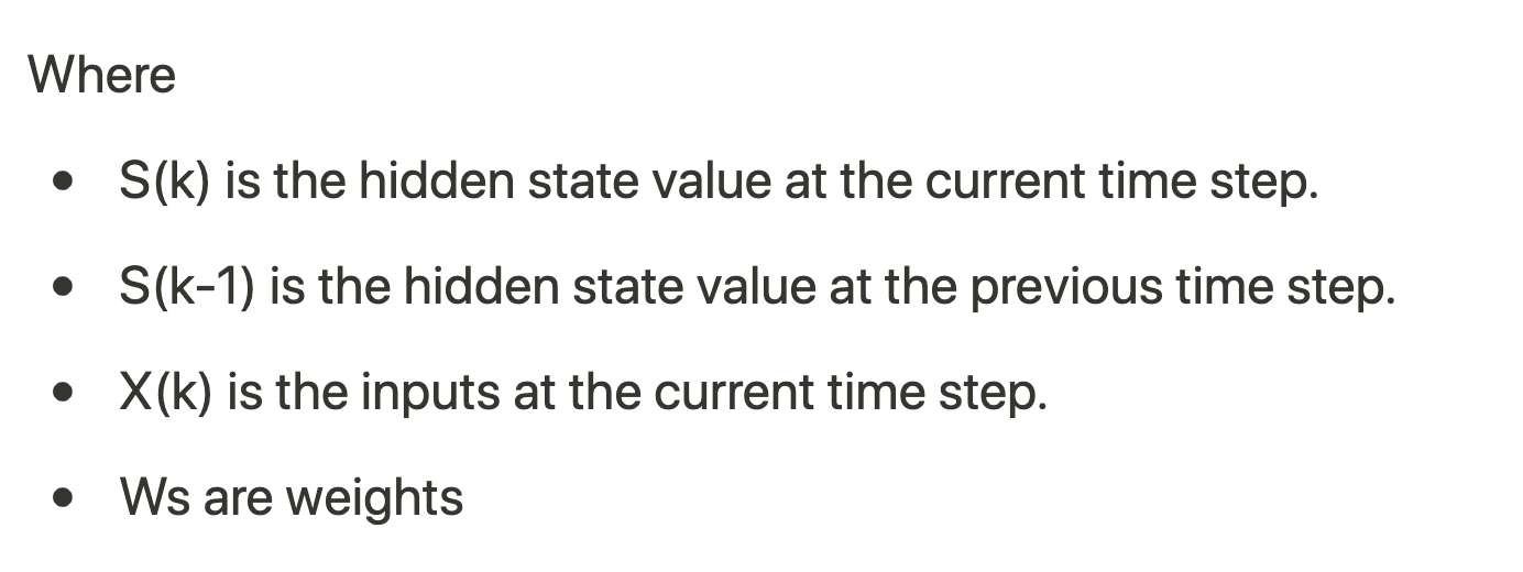
To improve our current model, we can use Recurrent Neural Networks (RNNs) instead of Deep Artificial Neural Networks. RNNs benefit from the fact that they can model Temporal dependence very well (Temporal dependence is the dependence of the current value of a quantity on past values of the same quantity). This is true because RNNs are modelled such that their hidden state value at the current time step depends on the inputs at the current time step and the hidden state value at the previous time step.
For further improvements, we can use Long Short-Term Memory Networks. LSTM models can consider longer sequences of past data as compared to RNNs due to their characteristic feature of cell state to store, forget, update, and output data over a period of time.
Authored By,
Chekhov Squad
References
- Chirag Deb, Fan Zhang, Junjing Yanga, Siew Eang Leea, Kwok Wei Shaha. (Feburary 2017). A review on time series forecasting techniques for building energy consumption. Renewable and Sustainable Energy Reviews. https://www.researchgate.net/publication/314086599_A_review_on_time_series_forecastingtechniques_for_building_energy_consumption